In our increasingly digital-centric world, a website isn’t merely a source of information—it’s the frontline of your brand identity. As devices diversify and users shift fluidly between desktops, tablets, and mobile phones, ensuring a seamless and engaging web experience across all platforms has never been more vital. With Top Captures, explore the intricate world of tailored web design for every device and understand the nuances that can transform a visitor into a loyal customer.
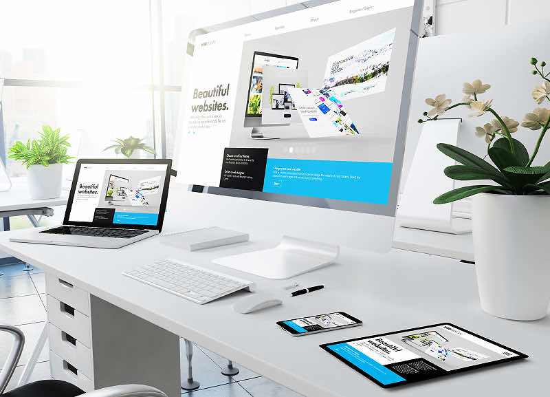
The Digital Trifecta: Desktop, Tablet, & Mobile
1. Desktop – Grand and Immersive: With the most significant screen real estate, desktop design offers an immersive experience. Detailed graphics, extensive content, and intricate layouts come to life, allowing for a deeper engagement with users.
2. Tablet – The Balancing Act: Striking the balance between the expansive desktop and the concise mobile, tablet design merges the best of both. With touch-enabled interactivity, the user experience becomes more tactile and direct.
3. Mobile – Swift and Streamlined: Given the soaring mobile internet usage, mobile-responsive design is non-negotiable. Prioritizing essential information, ensuring fast load times, and optimizing touch controls are paramount.
Why Multi-Device Compatibility Matters:
Audience Reach: Different users prefer different devices at different times. A seamless design ensures you captivate them all, irrespective of their choice of platform.
Google Rankings: Google rewards mobile-friendly, responsive designs with higher search rankings, making multi-device optimization critical for SEO.
User Experience: Consistent design and functionality across devices lead to a positive user experience, which can drive conversions and brand loyalty.
Top Captures’ Mastery in Multi-Device Web Design:
Adaptive Layouts: We craft adaptive layouts that ensure your content looks stunning and remains user-friendly across all devices.
Fluid Graphics: Our graphics are designed to scale, ensuring clarity and sharpness, whether viewed on a large desktop monitor or a compact mobile screen.
Interactive Elements: We prioritize interactivity tailored to each device, from mouse-hover effects on desktops to touch-responsive features on tablets and mobiles.
Performance Optimization: Recognizing that users have varying internet speeds across devices, we optimize performance to ensure swift load times and smooth navigation.
Why Choose Top Captures for Your Web Design Needs?
Experienced Team: Our seasoned designers stay updated with the latest in web design trends, ensuring your website is both contemporary and compliant.
Diverse Portfolio: From e-commerce giants to local businesses, our portfolio is a testament to our flexibility and commitment to excellence.
Holistic Approach: Beyond design, we consider SEO, content strategy, and user behavior analytics, ensuring a comprehensive approach to your digital presence.
Client-Centric Collaboration: We believe in co-creation. By integrating client feedback at every stage, we ensure the final design mirrors your brand ethos and vision.
Navigating the Digital Landscape with Precision
In the vast digital landscape, standing out requires more than just a functional website. It demands a strategic, user-centric approach that caters to every device with precision. With Top Captures by your side, embark on a journey from a mere online presence to a digital powerhouse.
Eager to elevate your brand’s digital footprint with a responsive, stunning website tailored for all devices? Get in touch with Top Captures today, and let’s weave digital magic together!